
Vibe Design: My Field Notes
I've been building a mobile app on my own for six months. WorkWise is a private place for workers to document harassment, discrimination, or retaliation before they need a lawyer, an HR meeting, or the courage to escalate. The kind of app where trust has to land in the first three seconds, because the people who open it have something on the line.
I'm a product designer by training. I write CSS and HTML when I want them, and let AI handle the rest with me directing. In that time I've built a working prototype, published a design system, and prepared a developer-ready handoff spec.
The technique deserves a name: Vibe Design.
People know vibe coding. Describe what you want, AI writes the code. What I'm doing is its sibling: vibe design. Describe what you want, AI generates the screen, your taste does the editing.
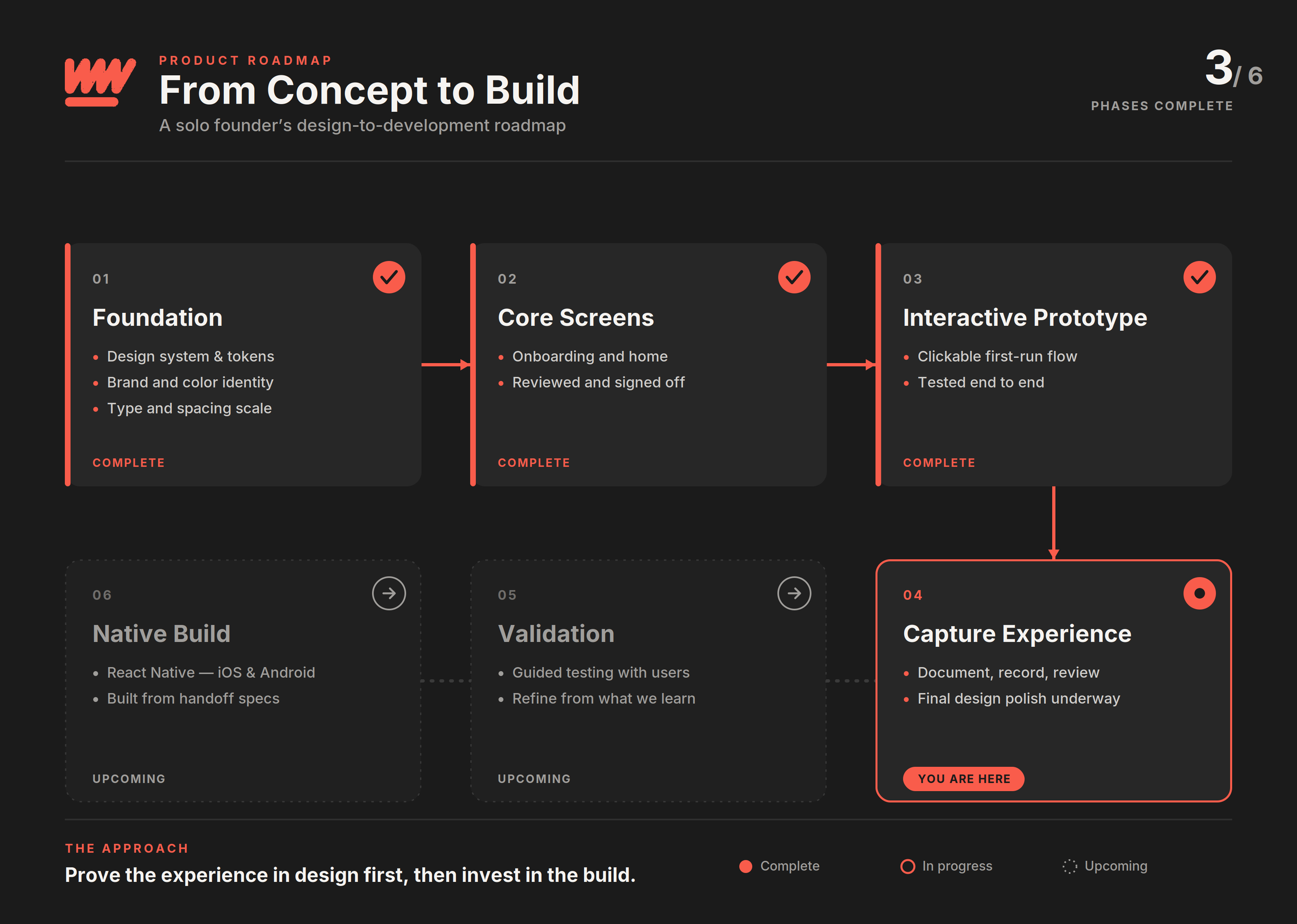
Product Roadmap: From Concept to Build.
Where I Am Right Now
Six phases. Three done, one in progress, two ahead. The diagram shows the shape of the project, but that shape exists only because of what happened beneath it.
The Design System Carries Everything
Early on, I assumed the hard part would be the screens. Getting the layouts right, picking the components, wiring the flows. That turned out to be the straightforward part. AI handles layout generation well enough. The hard part, the part that took real weeks, was building the scaffolding underneath.
I built a token system on top of Material Design 3. Color, typography, spacing, all mapped to named variables in Figma, all sourced from a print-inspired palette I've been developing called Broadside. Press Black, Manifesto Red, Gilt Gold, Vellum. Each color has a job. Each token has a name. Every screen in the app pulls from the same well.
Without the token system, every AI-generated screen looks like a different app. Same components, same layout logic, completely different feel. The AI has no memory between prompts. It has no opinion about your brand. It will cheerfully hand you a hundred screens that are each individually fine and collectively incoherent.
The tokens fix that. They become the constraint that forces convergence. With the scaffolding in place, every prompt I write lands in the same product, no matter how different the screen. The system decides. I steer.
Two Tracks, One Product
The work I just described splits into two completely different deliverables. I started calling them UI Marketing Design and UI Design Systems because collapsing them into one process is where most of the time and money gets lost.
UI Marketing Design is the pitch artifact. Fast screens generated by AI, tweaked for visual consistency, optimized for investors or stakeholders who need to see the product before it exists. The audience is people who need to be persuaded. Speed matters. Polish matters. Component logic does not.
UI Design Systems is the production artifact. Tokens, components, variant logic, developer specs. The audience is the engineering team that will actually build the thing. Precision matters. Architecture matters. Speed is secondary.
Most founders I talk to collapse these into one process. They hand pitch screens to a developer and wonder why the build takes three times longer than the estimate. The pitch was never meant to ship. It was meant to validate.
The correct sequence: marketing design first to prove demand, system design second to serve supply. Traction from the first funds the second.
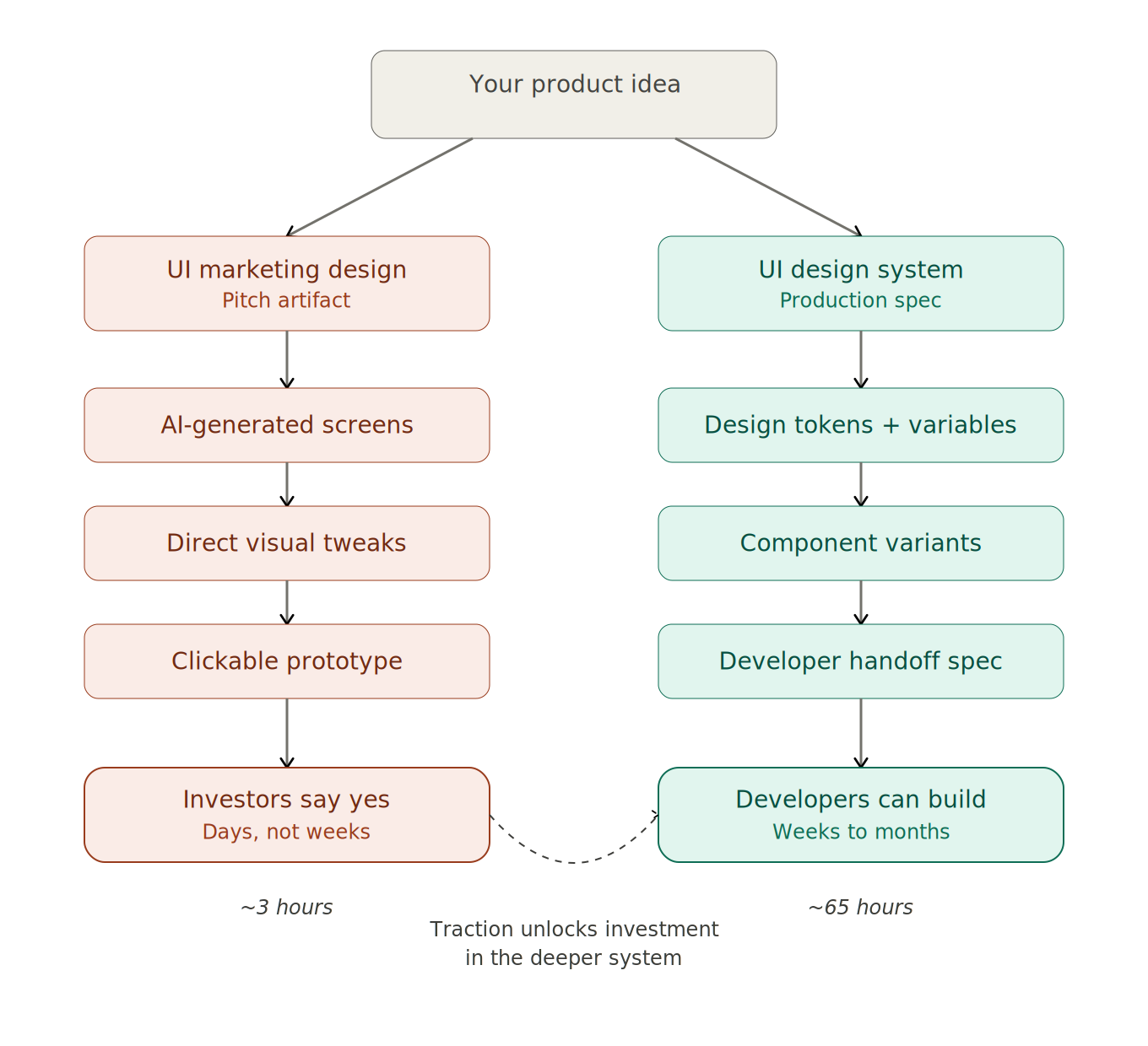
UI Marketing Design vs. UI Design System.
The Shortcut That Broke
I tried to skip the build. There's a tool that promises to sync your Figma designs directly to a working app. No code, no developer, straight from the design file. I spent real time on it. Set up the project, connected the file, started tagging components.
It collapsed the moment I pointed it at a real component library. The sync model expected flat, hand-placed layers. I built my file on a proper M3 component system with instances, variants, and auto-layout. The tool wanted simple. My file was correct. Those turned out to be different things.
That failure taught me the most useful lesson of the whole project so far. Any tool that asks you to flatten your design system to use it is telling you something about its own limitations, not yours.
I went back to Figma's native prototyping, wired the flows by hand, and had a working clickable prototype in an afternoon. The boring path worked.
Taste Does the Editing
AI generates. You curate. The bottleneck is your ability to look at what the AI made and know, quickly and confidently, whether it belongs in your product. That judgment is taste. And taste comes from the work you did before you ever opened the AI tool: the token system, the color decisions, the spacing scale, the hours you spent looking at your own screens until you could feel when something was off by four pixels.
The vibe is real. The system is what makes the vibe repeatable.
What's Coming
This is the first post in a series. I'll be writing about the specific decisions, tools, failures, and patterns I'm finding as I build WorkWise from design through validation to a native app, all as a solo founder working with AI as a design collaborator.
Next up: where taste actually comes from, and why AI might be quietly eroding the thing that makes it valuable.
Follow along at spiker.work or find me on LinkedIn.
Vibe Design · Post 1