Waste Free Celebrations Case Study
Q4 Website Optimization
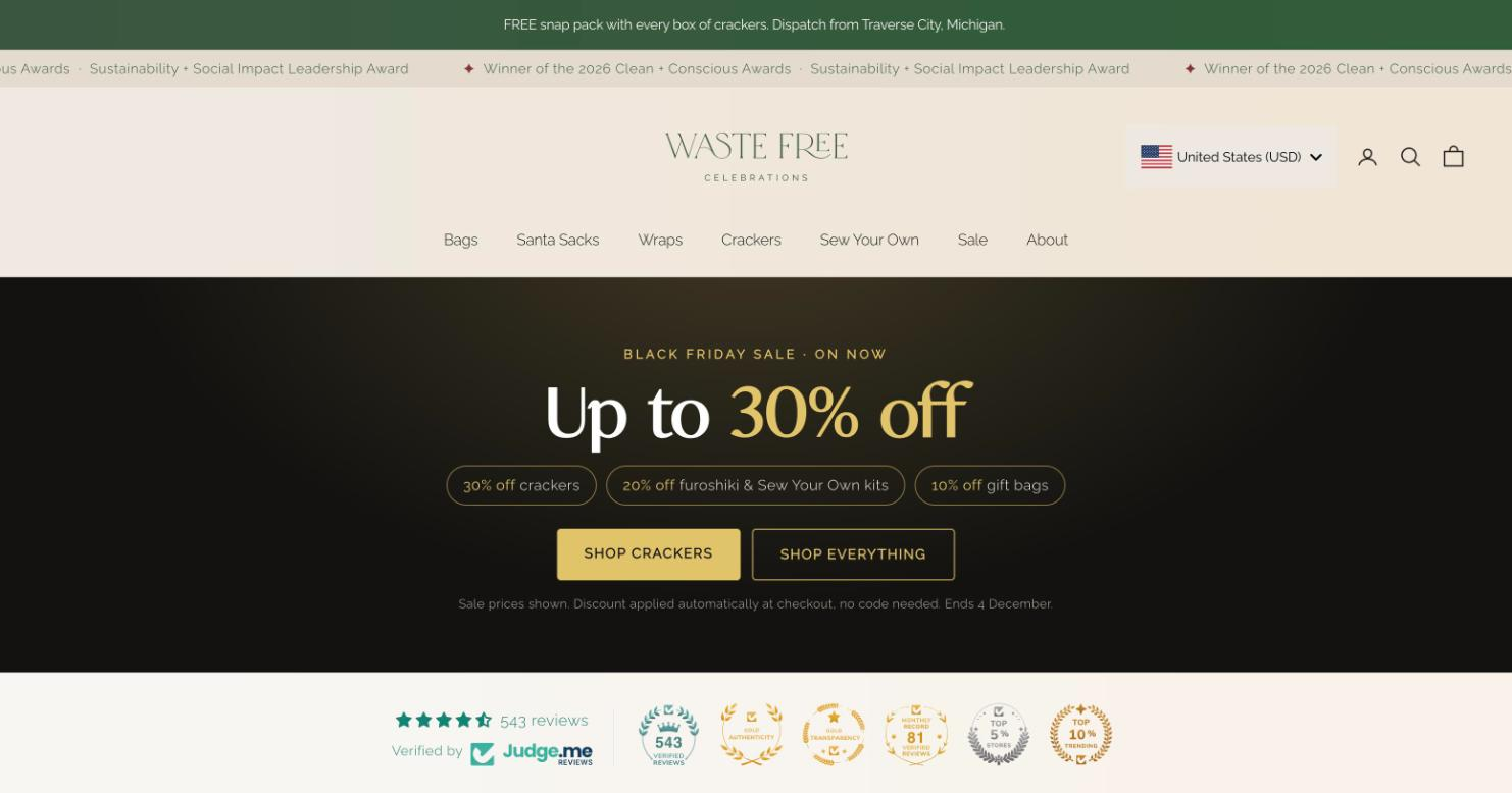
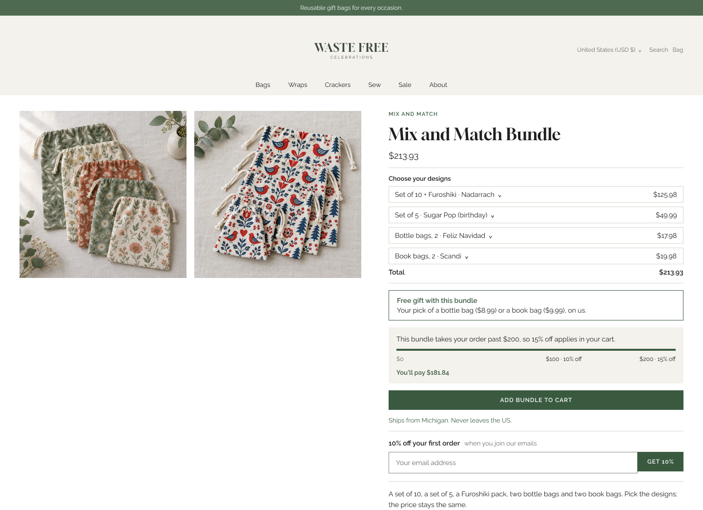
The Waste Free Celebrations US homepage, November 2026.
Overview
Waste Free Celebrations sells reusable gift bags, Furoshiki wraps and Christmas crackers through a Shopify store serving New Zealand, the UK, the US and Canada. Ahead of peak trading, the brief was to raise conversion and average order value across all four markets.
We worked as strategist, designer and code generator on three workstreams: a pre-cart redesign to lift order value, an email capture rework to replace stacked pop-ups, and dispatch messaging to reduce international drop-off.
Deliverables were audits, strategy documents, Figma designs, copy and implementation-ready code. The client’s team integrated, tested and deployed the code in house.
Role: Strategist, designer, code generator
Duration: September–November 2026
Platform: Shopify, multi-region storefront
1. Pre-cart redesign
The audit found three cart incentives competing for attention, shipping cost hidden until address entry in every market, and progress-bar labels that did not match the tier discounts.
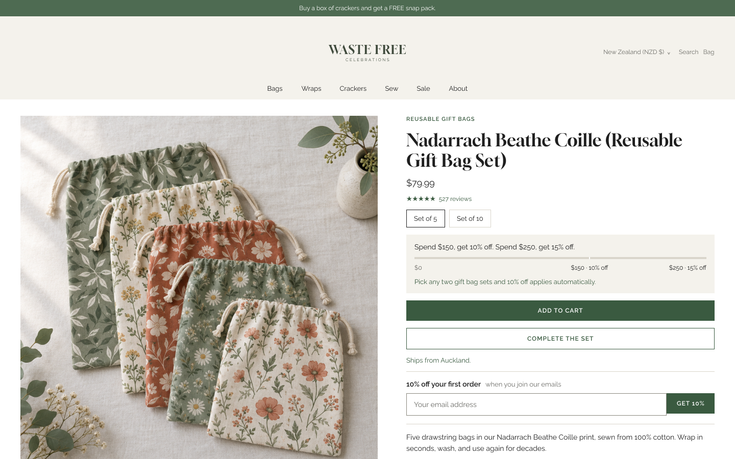
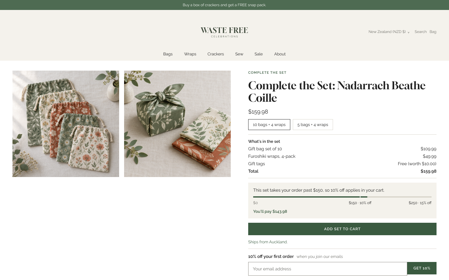
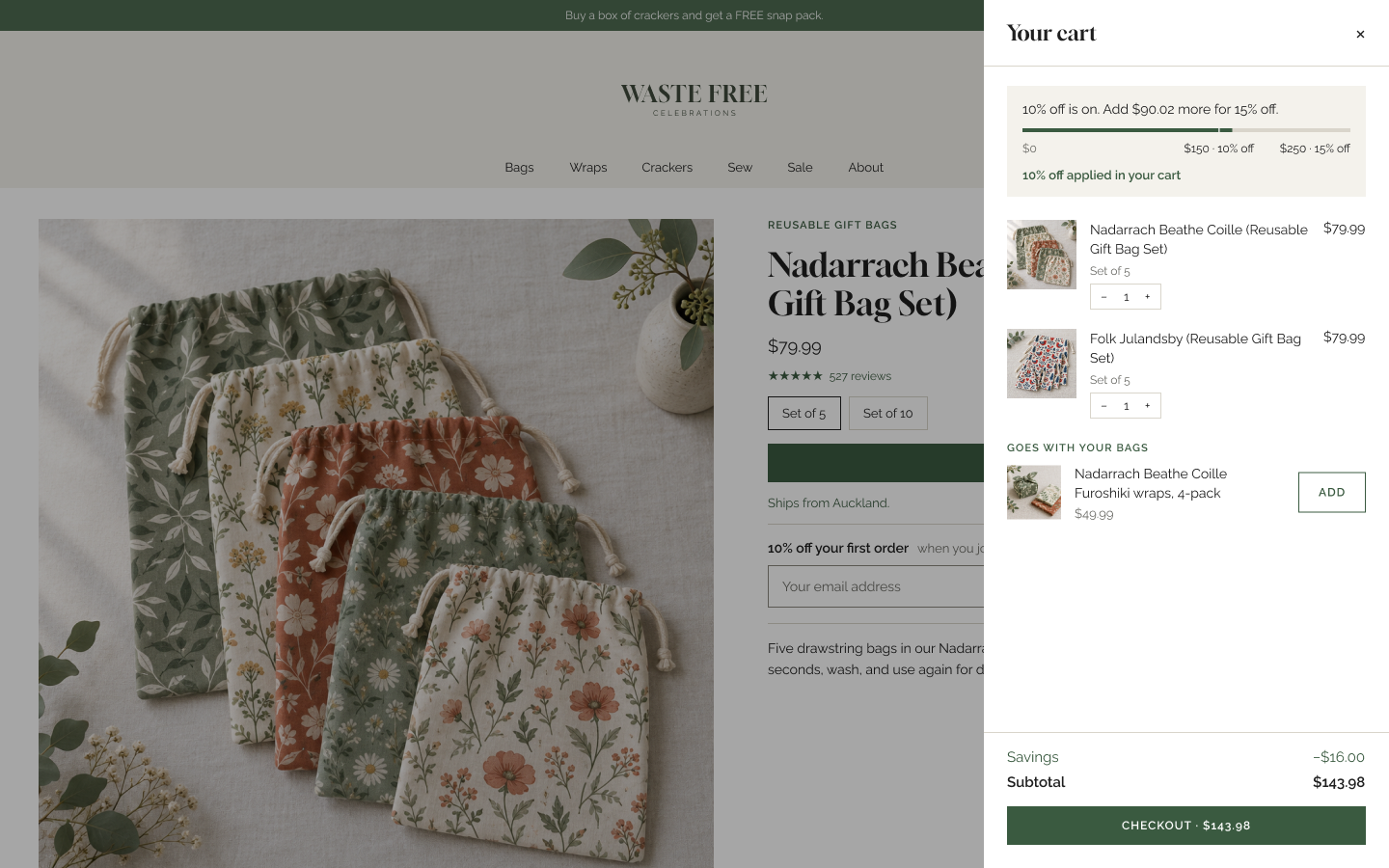
The response moves the incentive earlier. A Spend & Save bar sits where it can be seen before anything is in the cart, and bundle pages and cart drawer designs carry the same incentive logic through the path to checkout.
Delivered: an audit of the catalog and cart across regional storefronts, a bundle strategy document, Figma designs for the Spend & Save bar, bundle pages and cart drawer, copy for bundle callouts and cart incentives, and implementation-ready code (Liquid and JavaScript) for developer handoff.
2. Email capture
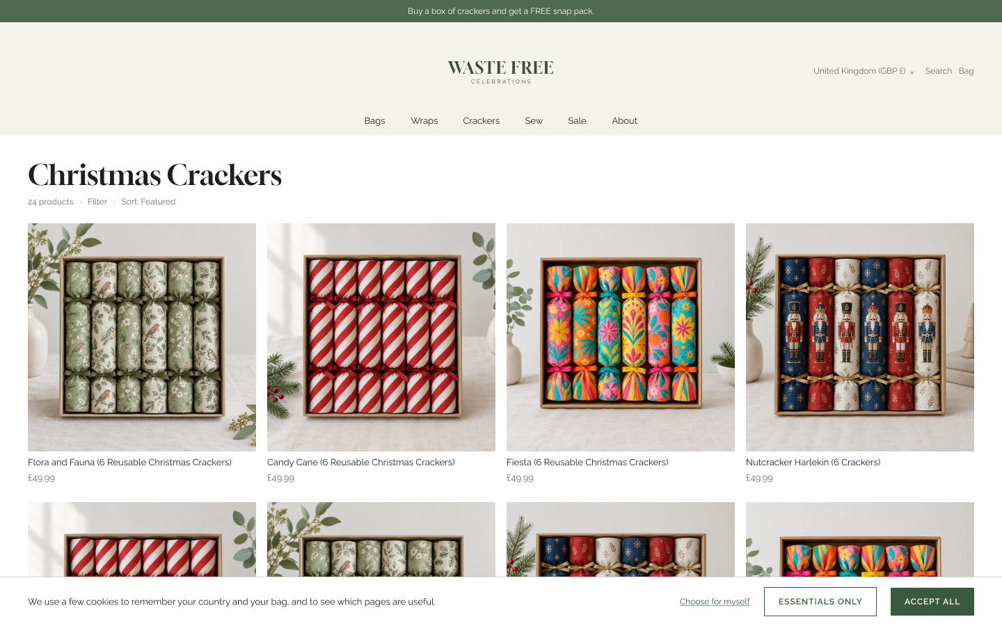
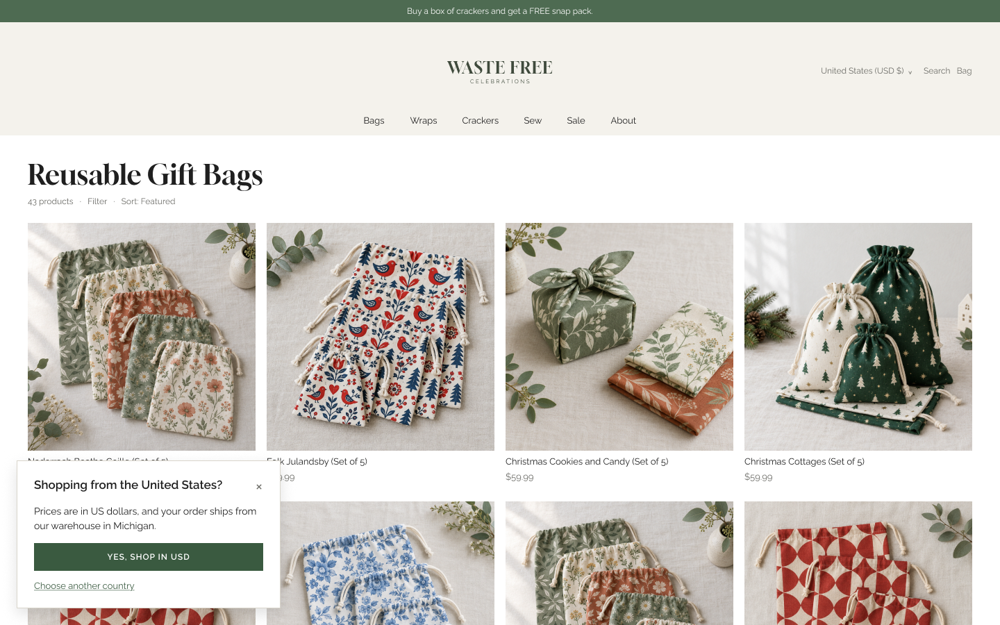
A first-time visitor could meet overlapping prompts. A region pop-up hid the 10% sign-up offer, which only reappeared after the redirect, and in some markets a cookie banner added a third. The offer the store most wanted people to see was the one most likely to be missed.
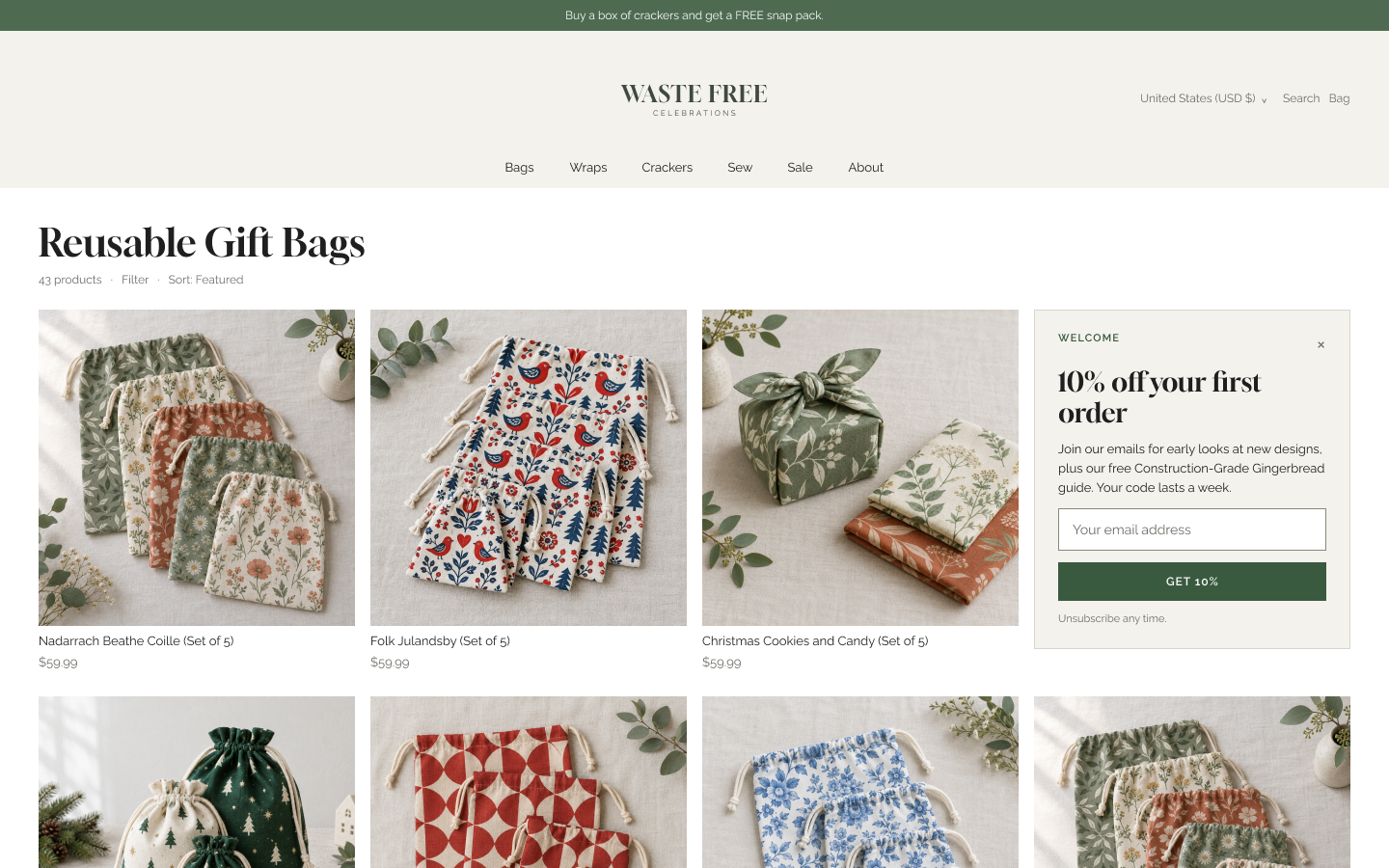
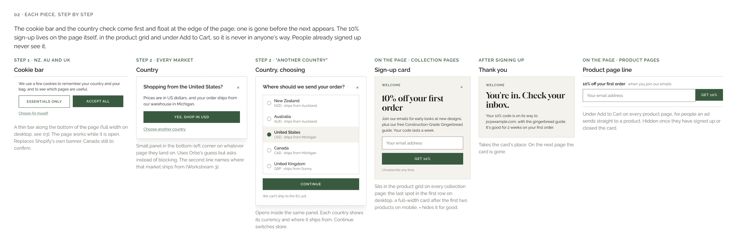
The redesign replaces stacked pop-ups with a sign-up card placed on the page itself, built around the store’s regional geolocator routing, and a welcome email that delivers the offer.
Delivered: an audit of the first-visit sequence, the non-pop-up capture design, a welcome email template, copy, and sign-up card code (HTML, CSS and JavaScript) with a proposed free book bag welcome offer. The email platform was already in place; integration and testing stayed with the client.
3. Dispatch messaging
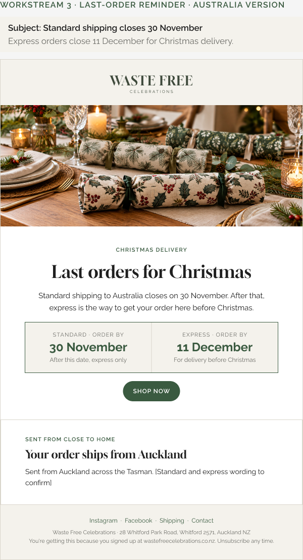
Australia ships from New Zealand and Canada from the US. Estimated delivery dates in the store settings were off, and last order dates for some markets had not been announced. The aim was to reduce international drop-off by making dispatch clear at the points where buyers decide.
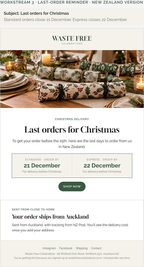
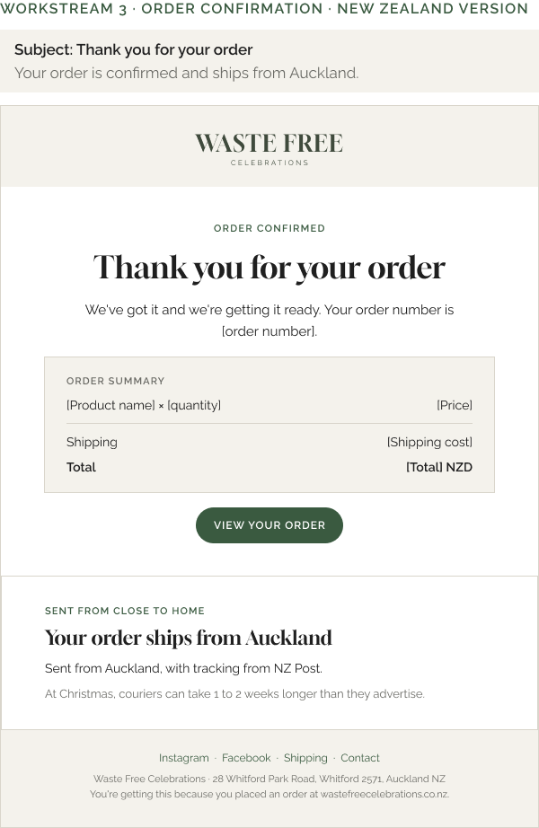
The strategy sets out regional messaging at key touchpoints, including last order dates and an email template with dispatch reassurance, with paste-in steps for updating dates as they are confirmed.
Delivered: a messaging strategy with regional variations, last-order-date messaging by region, an email template mockup, two rounds of revisions, and a fulfilment and shipping audit by market.
Results
- +12%Average order value
- +35%New sign-ups
- +8%Carts reaching checkout
- −10%International drop-off
Compared with the prior period.
How we worked with AI
Most of the production on this engagement ran through AI tools. We directed them, and the strategy and decisions stayed ours.
The models. Claude (Sonnet, Opus and Fable) for the audits, strategy documents, copy and code. Figma Make for composing screens, and Nano Banana for image generation. We also cross-validated some of Claude’s recommendations against Gemini, using it as a second opinion.
Claude inside Figma. Claude worked in the Figma file through Figma’s MCP (Model Context Protocol) connector. It read the existing frames and components, then built and edited screens directly instead of working from descriptions or screenshots.
A design system the model could follow. We wrote the file’s conventions (layout, type, components, copy rules) into a reusable skill. New screens started from the approved First Visit page and its shared components (the Spend & Save bar, sign-up card, cookie bar and cart line item), so every market and state stayed consistent.
Code built for handoff. Claude wrote the Liquid, HTML, CSS and JavaScript for the Spend & Save bar and the sign-up card, scoped for the client’s developers to integrate, test and deploy.
Judgment stayed with us. We chose which problems were worth solving and set the strategy. Every price, saving and total follows the agreed strategy documents.
This page was assembled the same way: from the deck and the Figma file, with Claude building the layout and the Results band in code.
How it ran
Async. No calls. Decisions were confirmed by email, so every document had to stand on its own.
Design revisions. Two rounds per deliverable, reviewed in Figma.
Scope control. Domain and URL research was removed at the client’s request because of deep integrations.
Peak-season planning. The timeline was revised when the client flagged that implementation would fall in peak trading.
Client’s role. The client’s team handled integration, testing and deployment in house. We did not provide hands-on development, theming or deployment.
September: audit and planning. October: design and handoff. November: close-out.
Selected screens
Click any screen to enlarge. These are wireframe-fidelity layouts. The product photography is illustrative placeholder imagery, not Waste Free Celebrations’ own photos.